前言;虽然现在有了flex弹性盒子模型;很多布局效果都可以通过flex盒子来实现;但由于flex盒子模型的兼容性不容乐观
ie至少要10才能支持flex;所以还是很有必要学习float流式布局的
栗子
正常的块级元素的布局是这样的;;文字代表元素的float属性;

对于float布局要记住;
1.如果浮动元素的上一个元素也是浮动;那么该元素会与上一个元素排列在同一行;如果行宽不够;后面的元素会被挤到下一行
2.如果浮动元素的上一个元素不是浮动;那么该元素仍然处于上一个元素的下方;根据浮动设定在左或者在右;而其本身也脱离普通流;后边的元素会自动往上移动到上一个普通流元素下方为止
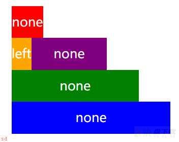
对第二个元素设置float;left;因为红色块不是浮动;所以橙色块仍在红色块下方;紫色块会向上移动到红色块;普通流;下方为止

如果对紫色块设置float;right;则紫色块和橙色块都会位于红色块;普通流;下方;而紫色块相邻的下一个绿色块也会向上移动到红色块;普通流;下方。
如果我们想让绿色块留在原本属于他的一行而不向上移动;可以给他加上clear:both;这样他就不会移动了

关于清除浮动;
1.清除浮动并不是说让浮动元素回到文档流
2.清除浮动只会改变改元素自身的位置;并且只针对排在该元素前面的元素。目的是让自己的左边或者右边没有浮动元素当然用clear做更多的事;比如我们不想让紫色块和橙色块在同一行;可以在紫色块上加clear;left

如果我们给绿色块加的属性不是clear;both;而是clear;left的话;紫色块和绿色块就在同一行了

关键是记住一项元素布局的是他的上一个元素;
比如我们给橙色块加clear;right;紫色块不加clear;则橙色块和紫色块在同一行;橙色块的clear属性不会影响到紫色块;

高度坍塌;
如果子元素是浮动;而父元素内没有其他内容;父元素的高度就会消失;我们可以通过设置border看到这个现象;

这个问题我们可以通过在父元素后面添加另外一个普通流元素来解决;最简单的就是用;after伪元素啦;
<style>
    #wrapper{
        width: 120px;
        margin: 50px auto;
        border:2px solid black;
    }
    .container{
        width: 100px;
        height: 100px;
        float: left;
        background: blue;
    }
    #wrapper:after{
        content: ; ;;
        display: block;
        height: 0;
        visibility: hidden;
        clear: both;
    }
</style>
<body>
    <div id = ;wrapper;>
        <div class = ;container;>
        </div>
    </div>
</body>
这样就解决了高度坍塌的问题
所谓圣杯布局;即是两边定宽;而中间自适应的一种布局; 用到浮动、负边距、相对定位;不添加额外标签
html结构为;
<div class = ;header;>header</div>
    <div class = ;container;>
        <div class = ;left;>left</div>
        <div class = ;center;>center</div>
        <div class = ;right;>right</div>
    </div>
<div class = ;footer;>footer</div>
填好一些公用的样式;
    .header,
    .footer{
        background: grey;
        height: 50px;
        width: 100%
        text-align: center;
        line-height: 50px;
    }
    .left,
    .center,
    .right{
        height:50px;
        text-align: center;
        line-height: 50px;
    }
    .left{
        background: red;
    }
    .center{
        background: black;
    }
    .right{
        background: purple;
    }
这时候页面的结构为;

接下来我们想让left和right各占50px宽度;中间自适应;
.header,
    .footer{
        background: grey;
        height: 50px;
        width: 100%
        text-align: center;
        line-height: 50px;
    }
    .container{
        padding: 0 50px;
    }
    .left,
    .center,
    .right{
        position: relative;
        text-align: center;
        line-height: 50px;
    }
    .left{
        float: left;
        width: 50px;
        margin-left: -50px;
        background: red;
    }
    .center{
        float: left;
        width:100%
        background: black;
    }
    .right{
        float: left;
        margin-left: -50px;
        right: -50px;
        width:50px;
        background: purple;
    }
    .footer{
        clear:both;
    }
即修改了container左右padding:50px;center宽度100%全部向左浮动;再加上left和margin等属性使之排列在一行

我们希望中间部分的高度被内容撑开;但此时如果任意一个的高度改变;其余两个的高度是不会变的;

这个问题我们可以通过padding补偿发来解决;
.container{
        padding: 0 50px;
        Overflow: hidden;
    }
    .left,
    .center,
    .right{
        position: relative;
        text-align: center;
        line-height: 50px;
        padding-bottom: 1000px;
        margin-bottom: -1000px;
    }
主要是修改外层container的overflow;hidden;给子元素一个足够大的padding并margin负值回来;就能够同时改变高度了;

最终代码;
<style>
    #wrapper{
        width: 300px;
        height: 1000px;
        margin: 50px auto;
        line-height: 200px;
        font-size: 20px;
        color: white;
        text-align: center;
        overflow: hidden
    }
    .header,
    .footer{
        background: grey;
        width: 100%
        text-align: center;
        line-height: 50px;
    }
    .container{
        padding: 0 50px;
        overflow: hidden;
    }
    .left,
    .center,
    .right{
        position: relative;
        text-align: center;
        line-height: 50px;
        padding-bottom: 1000px;
        margin-bottom: -1000px;
    }
    .left{
        float: left;
        width: 50px;
        margin-left: -50px;
        background: red;
    }
    .center{
        float: left;
        width:100%
        height: 100px;
        background: black;
    }
    .right{
        float: left;
        margin-left: -100%
        right: -100%
        width:50px;
        background: purple;
    }
    .footer{
        clear:both;
    }
</style>
<body>
    <div id = ;wrapper;>
        <div class = ;header;>header</div>
        <div class = ;container;>
            <div class = ;left;>left</div>
            <div class = ;center;>center</div>
            <div class = ;right;>right</div>
        </div>
        <div class = ;footer;>footer</div>
    </div>
</body>
至此;就简略的复习完了float和圣杯布局的基本知识